Contacts
3.7star
1.08M reviewsinfo
1B+
Downloads

PEGI 3
info
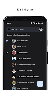
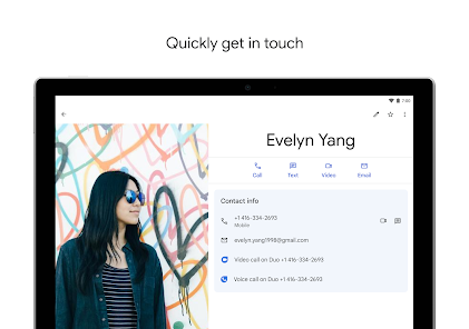
About this app
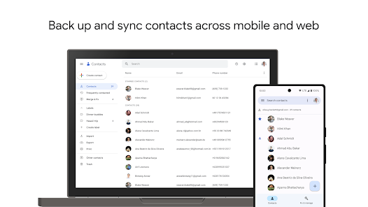
Back up your contacts and sync them across all your devices
• Safely back up the contacts in your Google Account to the cloud
• Access the contacts in your Google Account from any device
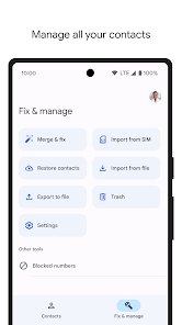
Keep your contacts organized and up to date
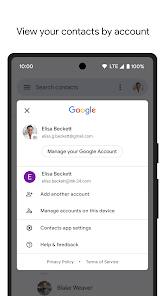
• View your contacts by account (e.g., work vs. personal)
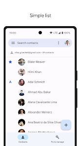
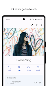
• Easily add contacts and edit information like phone numbers, emails, and photos
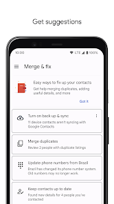
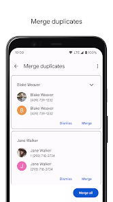
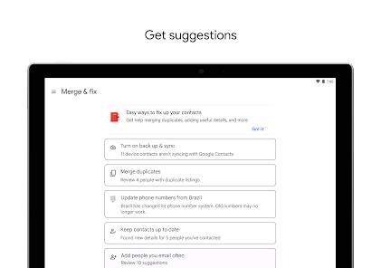
• Get suggestions for adding new contacts, merging duplicates, and more
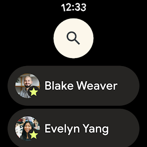
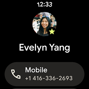
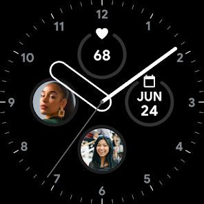
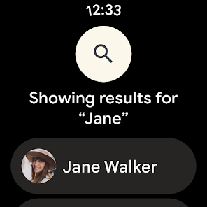
Also available for Wear OS.
Updated on
Safety starts with understanding how developers collect and share your data. Data privacy and security practices may vary based on your use, region, and age. The developer provided this information and may update it over time.
No data shared with third parties
Learn more about how developers declare sharing
This app may collect these data types
Personal info, Photos and videos and 4 others
Data is encrypted in transit
You can request that data be deleted
Independent security review
Ratings and reviews
3.7
1.08M reviews
Shazad Shazad ali
- Flag inappropriate
December 24, 2022
Like most things, once it achieved perfection, started to fall off. Added labels to the top of the app that I don't want nor use, can't be turned off. Can't filter by removing labels, only single label or additive, so you can't have an archive label or a deleted or old you can hide. Either keep it simple and minimalistic or make it a nice tool. This is a simple, intuitive app with some buttons on top and a filter that is mediocre. Can't wait for the Inevitable redesign.
792 people found this review helpful
Thomas Robertson
- Flag inappropriate
January 13, 2023
Can't customize contacts I've accidentally sent messages to the wrong person because I've associated a color to a particular person. It's embarrassing and annoying. Someone the color on the contact page differs from the color on the text page. We should have the ability to assign any color to any contact. I now have to triple check the recipient. Why would repeating the same X number of colors for contacts ever be a good idea? This isn't an Apple phone, give me some damn control!!
88 people found this review helpful
Sri B
- Flag inappropriate
November 4, 2022
The recent update changed the image of the app, and it's causing dizziness to me. The new image(with white background, and blue person) looks like two persons' images superimposed on each other. Images appear this way when you have short sight, and right now it's causing me to believe that my sight has increased. Revert to the old image, or remove the superimposition. Also, when everybody is moving to dark mode, I don't know why you chose the opposite for the app image; change to dark mode.
2,663 people found this review helpful
What's new
• Updated icon that better reflects today's modern experience and shares the same design language as many of Google's other helpful products
• Filter your contacts list to show only contacts with phone numbers or email addresses, or filter by Company
• See information about your contacts that you added with Google Assistant
• Filter your contacts list to show only contacts with phone numbers or email addresses, or filter by Company
• See information about your contacts that you added with Google Assistant
